User Interfaces: Examples of Bad UI
The Yale University School of Art
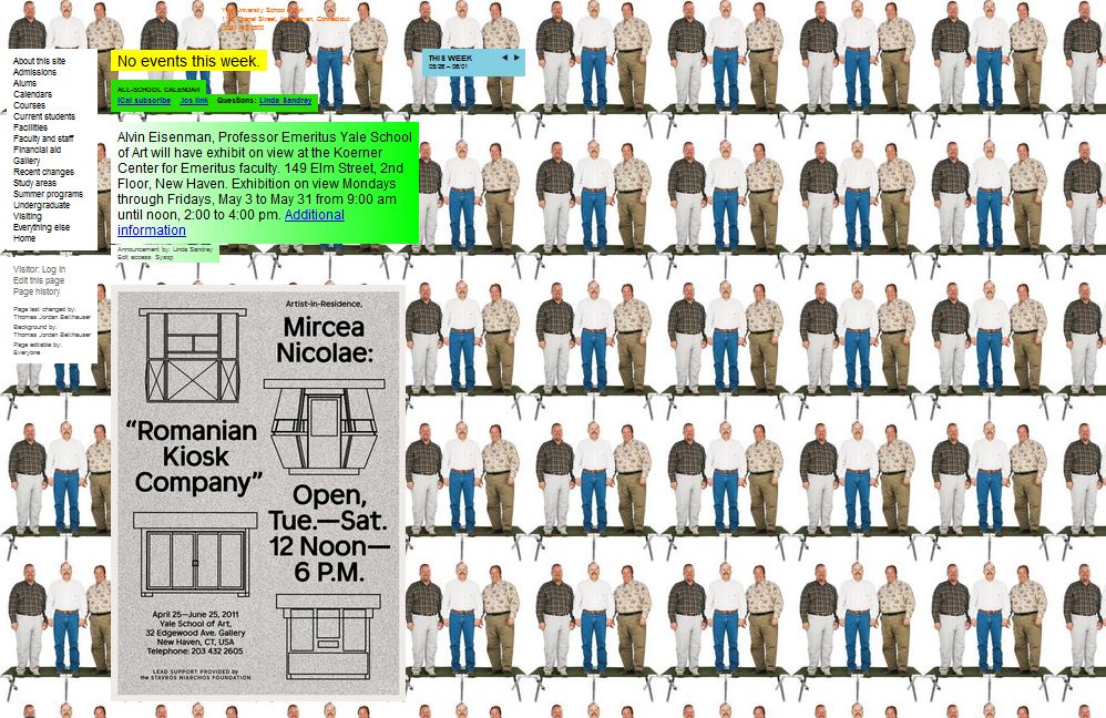
The Yale Art School website has many characteristics which make it appear untrustworthy.
- The pages’ backgrounds are distracting. Having a different background for each subpage pulls the viewer’s attention away from the important information on the pages. Even worse, some of the backgrounds are animated and draw the user’s attention away from the content to the movements. The different background images appear to be an attempt to showcase students’ work, but if such is the case, then a better design would be to have a page with a plain, solid-color background and a slide show of student art.
- The text boxes’ backgrounds are also distracting. The different-colored backgrounds, as well as the use of gradients, confuse the viewer as to which text is important to read.
- Both the pages and the text boxes on pages have scroll bars. Thus, a user may have to drag two different scroll bars to view all the content on page, which is an annoying process.
Because of the distracting features, the viewer is unsure of how to interpret the information on the site and thus dismisses it. Even with the name of Yale in the URL, the UI makes the viewer question whether or not they are actually on the real Yale Art School website or whether they have stumbled onto a fraud.
Control Driving Skills: The Bob Joynt School
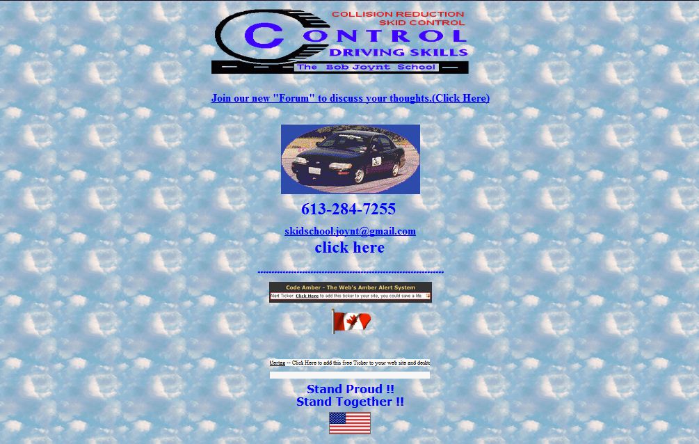
The UI of the Control Driving School website makes viewers hesitant to inquire about their service--let alone sign up for their school.
- It makes the mistake of having a tiled, repeating background of a picture of clouds. To a user, it is not clear how clouds relate to safer driving.
- The website places the navigation halfway down the home page. As a result, the viewer easily overlooks it as it blends with the rest of the flashy icons on the page.
- The very long home page is crowded with information sparsely laid out resulting in the user having to spend considerable time scrolling to the bottom. The viewer has to wade through lots of advertisements and animations to find the important contact information for the driving school.
- Although the site appears to use only one font, each line has its words in a variety of colors with some bold and others underlined. Though these different colors may add emphasis to certain lines, the technique is overdone and the viewer perceives it as distracting and not meaningful.